Pick
Find and collect records from a collection, then commit them as a set.
Some tasks are not about narrowing what is already on screen. They are about going to a collection, finding the right records, and bringing a chosen few back into the task at hand. Adding performers to an event, choosing venues for a report, granting a set of users access: each starts from nothing selected and ends with a committed set. This is picking, and it is a different pattern from filtering.
Filter vs Pick
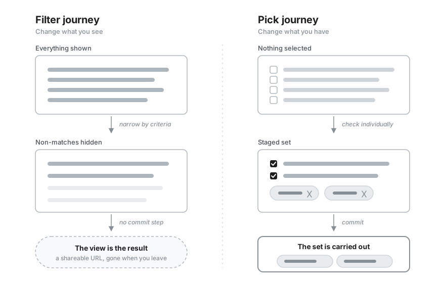
The two look alike because both use a search field and both end in a smaller set. The difference is the mechanism. Filtering narrows a visible dataset by criteria, and the narrowed view is the result. Picking enumerates individual records from a collection and commits them, and the committed set is the result, carried somewhere else. One question separates them: how does the smaller set come about? If the user sets criteria such as type, date, or status, it is a filter. If the user checks individual records one by one, it is a pick. One case looks deceptive: ticking values in a facet filter, such as brand, size, or category, feels like checking records off one by one, but those values are criteria, so it stays a filter.
| Aspect | Filter | Pick |
|---|---|---|
| Result | The same collection with non-matches hidden. The view is the answer. | A committed set of records, used somewhere else. |
| Mechanism | Narrow by criteria. Everything is shown by default. | Enumerate individual records. Nothing is selected by default. |
| Commit | Continuous and reversible, with no point of no return. | An explicit step. Cancelling discards the whole set. |
| Modality | Usually non-modal, the view stays in place. | The heavier the pick, the more it leans modal or takes its own surface. |
| Destination | The URL as query state, gone once you leave. | The host task, as a shareable URL or a saved record. |
One picture keeps them apart. Filtering is turning a camera lens, you change what you see and the collection itself stays put. Picking is filling a basket, you change what you have and leave with it.
When not to use a pick
Picking is for choosing records, not changing them. To create or edit a record's fields, use a drawer as described in the Table Records pattern. To narrow a dataset that is already on screen, use the Filter pattern. And to act on rows the user is already looking at, stay on the page with the filter, select, act approach below rather than opening a dialog.
Choose the surface by collection size
Reach for a pick when the user has to assemble a set of records that lives somewhere other than the current screen. The records may be too many to show inline, they may sit in a separate collection, or choosing them may deserve its own focused space. Every pick has the same shape: it begins with nothing selected, the user finds and stages records, and it ends when they commit the set or discard it.
The dialog is the default, but it is only one point on a spectrum. As the collection grows and the choice carries more weight, the right surface moves with it. Do not reach straight for a modal. Match the surface to how much picking the task really involves.
| Situation | Surface | Why it fits |
|---|---|---|
| A few options that are already on the page | Inline multi-select, the Multiple Selection pattern | The options are already in front of the user, so anything heavier only adds clicks. Reach for this first. |
| A longer list that can still stay on the page | Searchable field, a <TagField> | The field opens a popover of matches as the user types and shows the chosen ones as tags, all without leaving the page. |
| A real find-and-collect task | Dialog, the default | Room for search, filters, a selectable list, and a commit footer, focused over the page without navigating away. Scales from large to fullscreen as the table grows. |
| A pick that needs its own place | Routed page, the exception | Use it when the pick needs its own URL, appears in several places, or is used often. A pick that is merely large fits a size="fullscreen" dialog first. |
The direction is the through-line: keep the pick on the page while you can, move to a dialog once it becomes a task in its own right, and leave the page only when even a fullscreen dialog is not enough.
One surface sits to the side of this progression: a transfer list, two panes with available records on the left and chosen ones on the right. It fits a pick where the user wants to watch the whole selection build up beside the source, but it is space-hungry and rarely earns its cost, so use it sparingly. Marigold has no dedicated component for it yet, so today it is a hand-built layout rather than a ready surface.
The searchable-field tier in action: a <TagField> picks the performers for an event. Type to filter the roster, choose from the popover, and each pick becomes a removable tag. The selection is the committed set, so there is no separate commit step and the user never leaves the page. This is the whole tier below the dialog: names the user recognizes, no detail worth a table, and a collection small enough to stay in a field.
import { useState } from 'react';import type { Key } from '@react-types/shared';import { Panel, Stack, TagField, Text } from '@marigold/components';const performers = [ { id: 'aurora-glass', name: 'Aurora Glass' }, { id: 'neon-harbor', name: 'Neon Harbor' }, { id: 'velvet-static', name: 'Velvet Static' }, { id: 'midnight-cartography', name: 'Midnight Cartography' }, { id: 'saltwater-choir', name: 'Saltwater Choir' }, { id: 'brass-district', name: 'Brass District' }, { id: 'echo-and-ivory', name: 'Echo & Ivory' }, { id: 'the-lantern-club', name: 'The Lantern Club' }, { id: 'northern-signal', name: 'Northern Signal' }, { id: 'coral-transit', name: 'Coral Transit' }, { id: 'wildflower-radio', name: 'Wildflower Radio' }, { id: 'granite-youth', name: 'Granite Youth' }, { id: 'the-tidal-order', name: 'The Tidal Order' }, { id: 'paper-lantern-parade', name: 'Paper Lantern Parade' },];export default () => { // The selection is the committed set: the tags update live, so this tier // needs no explicit commit step the way the dialog does. const [lineup, setLineup] = useState<Key[]>([]); const chosen = performers .filter(performer => lineup.includes(performer.id)) .map(performer => performer.name); return ( <Panel aria-label="Event line-up"> <Panel.Content> <Stack space={4} alignX="left"> <TagField label="Line-up" description="Search the roster and add performers to this event." placeholder="Search performers..." items={performers} value={lineup} onChange={setLineup} width={80} > {performer => ( <TagField.Option id={performer.id}> {performer.name} </TagField.Option> )} </TagField> <Text> {chosen.length === 0 ? 'No performers added yet.' : `Line-up (${chosen.length}): ${chosen.join(', ')}`} </Text> </Stack> </Panel.Content> </Panel> );};Sizing a heavy pick
A size="large" <Dialog> gives about 640px of
height and 1024px of width on desktop, room enough for a search field, a
scrollable list, and a footer. When a pick carries a wide table or many rows
that a large dialog would cramp, size="fullscreen" fills the viewport, as
the example does. Use a routed page only when the pick needs
its own URL or appears in several places. A pick that is simply large belongs
in a fullscreen dialog.
The pick dialog
The dialog is the pattern's default surface and the most composed, so it is worth walking through part by part. It gathers a pick into one focused place that floats over the page rather than navigating away, its parts stacked in a predictable order from the trigger that opens it down to the footer that ends it.
A trigger in the host task opens the dialog, such as an "Add venues" button, and nothing is staged until the user opens it and commits. Inside, a title names what is being picked, such as "Select venues". Below the title, a <SearchField> finds records by name as the user types and narrows the visible rows without touching what is already staged. Optional filter controls sit beside it, criteria such as status or type that slice a large pool further.
The matching records form the results collection, shown as a <Table> when they carry detail worth scanning, such as a city and a capacity, or a plain list when the label is all there is. Checking a row stages it. A commit footer ends the task, where a cancel action discards the staged set and a primary action commits it, carrying the staged count in its label, "Add 3 venues".
The example below adds venues from a searchable, filterable, multi-select table.
import { useMemo, useState } from 'react';import type { Key } from '@react-types/shared';import type { Selection } from '@marigold/components';import { Button, Dialog, EmptyState, Inline, Panel, SearchField, Select, Stack, Table, Tag, Text,} from '@marigold/components';const venues = [ { id: 'astra', name: 'Astra Kulturhaus', city: 'Berlin', capacity: '1,500', type: 'Club', }, { id: 'gruenspan', name: 'Grünspan', city: 'Hamburg', capacity: '1,200', type: 'Club', }, { id: 'backstage', name: 'Backstage', city: 'Munich', capacity: '900', type: 'Club', }, { id: 'palladium', name: 'Palladium', city: 'Cologne', capacity: '4,000', type: 'Concert Hall', }, { id: 'capitol', name: 'Capitol', city: 'Hanover', capacity: '1,350', type: 'Concert Hall', }, { id: 'zakk', name: 'zakk', city: 'Dusseldorf', capacity: '1,000', type: 'Club', }, { id: 'batschkapp', name: 'Batschkapp', city: 'Frankfurt', capacity: '1,500', type: 'Club', }, { id: 'longhorn', name: 'LKA Longhorn', city: 'Stuttgart', capacity: '1,100', type: 'Concert Hall', }, { id: 'waldbuehne', name: 'Waldbühne', city: 'Berlin', capacity: '22,000', type: 'Open Air', }, { id: 'loreley', name: 'Loreley', city: 'St. Goarshausen', capacity: '15,000', type: 'Open Air', },];const types = ['Club', 'Concert Hall', 'Open Air'];interface PickBodyProps { initial: Set<Key>; onConfirm: (keys: Set<Key>) => void;}const PickVenuesBody = ({ initial, onConfirm }: PickBodyProps) => { const [search, setSearch] = useState(''); const [type, setType] = useState<Key | null>('all'); const [selected, setSelected] = useState<Set<Key>>(() => new Set(initial)); const results = useMemo(() => { const query = search.trim().toLowerCase(); return venues.filter(venue => { const matchesSearch = !query || `${venue.name} ${venue.city}`.toLowerCase().includes(query); const matchesType = type == null || type === 'all' || venue.type === type; return matchesSearch && matchesType; }); }, [search, type]); // Normalize react-aria's "select all" (which means the visible rows) to a // concrete set at the boundary, keeping venues staged under other filters, so // narrowing the list never changes what is committed. const onSelectionChange = (keys: Selection) => { const visibleIds = new Set<Key>(results.map(venue => venue.id)); setSelected(prev => { const offView = [...prev].filter(key => !visibleIds.has(key)); const visibleSelection = keys === 'all' ? [...visibleIds] : [...keys]; return new Set<Key>([...offView, ...visibleSelection]); }); }; const unstage = (keys: Set<Key>) => { setSelected(prev => { const next = new Set<Key>(prev); keys.forEach(key => next.delete(key)); return next; }); }; // The staged set is derived from `selected` alone, so it is independent of // the search and filter above and survives the list narrowing to nothing. const staged = venues.filter(venue => selected.has(venue.id)); return ( <> <Dialog.Title>Select venues</Dialog.Title> <Dialog.Content> <Stack space={4}> {/* Search and the type filter narrow the visible rows together; neither touches the staged selection tracked in `selected`. */} <Inline space={2} alignY="input"> <SearchField aria-label="Search venues" placeholder="Search by name or city" value={search} onChange={setSearch} width={64} /> <Select aria-label="Filter by type" value={type} onChange={setType} width={40} > <Select.Option id="all">All types</Select.Option> {types.map(t => ( <Select.Option key={t} id={t}> {t} </Select.Option> ))} </Select> </Inline> {/* The staged set stays on screen as removable tags no matter what the search and filter are doing, including when the list below is empty. The rail is always rendered, with a muted hint when empty, so staging the first venue never shifts the table. Removing a tag unstages that venue. */} <Tag.Group label={`Staged (${staged.length})`} selectionMode="none" onRemove={unstage} collapseAt={6} emptyState={() => ( <Text variant="muted" fontSize="sm"> No venues staged yet. Tick a row to add it. </Text> )} > {staged.map(venue => ( <Tag key={venue.id} id={venue.id}> {venue.name} </Tag> ))} </Tag.Group> <Table aria-label="Venues" selectionMode="multiple" selectedKeys={selected} onSelectionChange={onSelectionChange} > <Table.Header> <Table.Column rowHeader>Venue</Table.Column> <Table.Column>City</Table.Column> <Table.Column>Type</Table.Column> <Table.Column>Capacity</Table.Column> </Table.Header> <Table.Body items={results} emptyState={() => ( <EmptyState title="No venues match" description="Try a different search, or switch the type back to All types. Anything you already staged stays listed above." /> )} > {venue => ( <Table.Row id={venue.id}> <Table.Cell>{venue.name}</Table.Cell> <Table.Cell>{venue.city}</Table.Cell> <Table.Cell>{venue.type}</Table.Cell> <Table.Cell>{venue.capacity}</Table.Cell> </Table.Row> )} </Table.Body> </Table> </Stack> </Dialog.Content> <Dialog.Actions> <Button variant="secondary" slot="close"> Cancel </Button> {/* At least one venue is required, so an empty set can never commit. */} <Button variant="primary" disabled={staged.length === 0} onPress={() => onConfirm(selected)} > {staged.length === 0 ? 'Add venues' : `Add ${staged.length} ${staged.length === 1 ? 'venue' : 'venues'}`} </Button> </Dialog.Actions> </> );};export default () => { const [added, setAdded] = useState<Set<Key>>(() => new Set()); const addedVenues = venues.filter(venue => added.has(venue.id)); const removeVenue = (keys: Set<Key>) => { setAdded(prev => { const next = new Set<Key>(prev); keys.forEach(key => next.delete(key)); return next; }); }; return ( <Panel aria-label="Report venues"> <Panel.Content> <Stack space={4} alignX="left"> {/* The committed set lives on the host task as removable tags: drop one here, or reopen (pre-staged) to change the set. */} {addedVenues.length > 0 ? ( <Tag.Group label="Selected venues" selectionMode="none" onRemove={removeVenue} collapseAt={6} > {addedVenues.map(venue => ( <Tag key={venue.id} id={venue.id}> {venue.name} </Tag> ))} </Tag.Group> ) : ( <Text>No venues added yet.</Text> )} <Dialog.Trigger> <Button variant={addedVenues.length > 0 ? 'secondary' : 'primary'}> {addedVenues.length > 0 ? 'Edit selection' : 'Add venues'} </Button> {/* A modest pick fits a large dialog. The data-heavy /examples/pick opens fullscreen instead. */} <Dialog size="large" closeButton> {({ close }) => ( <PickVenuesBody initial={added} onConfirm={keys => { setAdded(keys); close(); }} /> )} </Dialog> </Dialog.Trigger> </Stack> </Panel.Content> </Panel> );};A few details make the dialog trustworthy:
- Name the outcome in the commit button, and carry the count. The primary action reads "Add 3 venues" rather than a generic "OK", so the user knows both what will happen and how much they are committing. Compose this button by hand from the staged count. The
<ActionBar>is built for floating bulk actions on a table, not for a dialog's commit footer, so it is the wrong fit here. - Bound the selection when the task requires it. Most picks need at least one record, so disable the commit until something is staged. An empty set can then never be committed by accident, and at zero the button reads "Add venues" and stays disabled rather than offering a clickable "Add 0 venues". If a pick also caps how many may be chosen, make the ceiling visible before it is reached, stop further checks once it is, and say why the rest are blocked, so the limit reads as a rule and not a bug.
- Never clear staged selections while filtering. Typing in the search narrows the visible rows, but records staged earlier stay staged even when they scroll out of view. Clearing them on every keystroke would make the pick impossible. This is the same tension as the filter paradox in Table Records.
- Show records the way the user recognizes them. When a record carries detail worth scanning, such as a city or a capacity, show each attribute in its own
<Table>column instead of a bare name. A plain list is enough when the label stands on its own. - Offer select all for bulk picks. A header control that selects every row, shown in a mixed state while the selection is partial, saves the user from working through a long list by hand. Keep it paired with search and filters so "all" applies to a sensibly narrowed set.
- Cancel discards, commit persists. Closing or cancelling throws the staged set away with no consequence. Only the primary action carries the selection back to the task.
A list when the label is enough
Not every pick needs a table. When you choose a record by its name, with at most a supporting line and no grid of comparable detail to scan across rows, a <SelectList> is the lighter collection: a multi-select list, checked to stage and committed the same way. An option can still carry a little more than a bare label, such as a name over an email, and it stays a list. Reach for a <Table> only once the records carry several attributes worth comparing side by side.
import { useMemo, useState } from 'react';import type { Key } from '@react-types/shared';import { Button, Description, Dialog, EmptyState, Inline, Panel, SearchField, Select, SelectList, Stack, Tag, Text, TextValue,} from '@marigold/components';interface Person { id: string; name: string; email: string; team: string;}// A stand-in for the directory a real access picker searches through.const people: Person[] = [ { id: 'mara-lindqvist', name: 'Mara Lindqvist', email: 'mara.lindqvist@northwind.co', team: 'Engineering', }, { id: 'diego-fuentes', name: 'Diego Fuentes', email: 'diego.fuentes@northwind.co', team: 'Engineering', }, { id: 'priya-nair', name: 'Priya Nair', email: 'priya.nair@northwind.co', team: 'Engineering', }, { id: 'tomasz-kowalski', name: 'Tomasz Kowalski', email: 'tomasz.kowalski@northwind.co', team: 'Engineering', }, { id: 'yuki-tanaka', name: 'Yuki Tanaka', email: 'yuki.tanaka@northwind.co', team: 'Design', }, { id: 'amara-okafor', name: 'Amara Okafor', email: 'amara.okafor@northwind.co', team: 'Design', }, { id: 'lena-hofmann', name: 'Lena Hofmann', email: 'lena.hofmann@northwind.co', team: 'Design', }, { id: 'sofia-rossi', name: 'Sofia Rossi', email: 'sofia.rossi@northwind.co', team: 'Marketing', }, { id: 'ben-carter', name: 'Ben Carter', email: 'ben.carter@northwind.co', team: 'Marketing', }, { id: 'noah-weiss', name: 'Noah Weiss', email: 'noah.weiss@northwind.co', team: 'Sales', }, { id: 'ingrid-sorensen', name: 'Ingrid Sørensen', email: 'ingrid.sorensen@northwind.co', team: 'Sales', }, { id: 'hana-kim', name: 'Hana Kim', email: 'hana.kim@northwind.co', team: 'Support', },];const teams = ['Engineering', 'Design', 'Marketing', 'Sales', 'Support'];interface PickBodyProps { initial: Set<Key>; onConfirm: (keys: Set<Key>) => void;}const PickPeopleBody = ({ initial, onConfirm }: PickBodyProps) => { const [search, setSearch] = useState(''); const [team, setTeam] = useState<Key | null>('all'); const [selected, setSelected] = useState<Set<Key>>(() => new Set(initial)); const results = useMemo(() => { const query = search.trim().toLowerCase(); return people.filter(person => { const matchesSearch = !query || `${person.name} ${person.email}`.toLowerCase().includes(query); const matchesTeam = team == null || team === 'all' || person.team === team; return matchesSearch && matchesTeam; }); }, [search, team]); // SelectList reports the visible selection as a Key[]. Merge it with the // staged keys that are currently filtered out of view, so narrowing the list // by search or team never drops what is already staged. const onChange = (keys: Key[]) => { const visibleIds = new Set<Key>(results.map(person => person.id)); setSelected(prev => { const offView = [...prev].filter(key => !visibleIds.has(key)); return new Set<Key>([...offView, ...keys]); }); }; const unstage = (keys: Set<Key>) => { setSelected(prev => { const next = new Set<Key>(prev); keys.forEach(key => next.delete(key)); return next; }); }; // Derived from `selected` alone, so the staged tags are independent of the // search and filter and survive the list narrowing to nothing. const staged = people.filter(person => selected.has(person.id)); return ( <> <Dialog.Title>Select people</Dialog.Title> <Dialog.Content> <Stack space={4}> {/* Search and the team filter narrow the visible rows together; neither touches the staged selection tracked in `selected`. */} <Inline space={2} alignY="input"> <SearchField aria-label="Search people" placeholder="Search by name or email" value={search} onChange={setSearch} width={56} /> <Select aria-label="Filter by team" value={team} onChange={setTeam} width={40} > <Select.Option id="all">All teams</Select.Option> {teams.map(t => ( <Select.Option key={t} id={t}> {t} </Select.Option> ))} </Select> </Inline> {/* The staged set stays on screen as removable tags no matter what the search and filter are doing, including when the list below is empty. The rail is always rendered, with a muted hint when empty, so staging the first person never shifts the list. Removing a tag unstages that person. */} <Tag.Group label={`Staged (${staged.length})`} selectionMode="none" onRemove={unstage} collapseAt={6} emptyState={() => ( <Text variant="muted" fontSize="sm"> No people staged yet. Tick a name to add them. </Text> )} > {staged.map(person => ( <Tag key={person.id} id={person.id}> {person.name} </Tag> ))} </Tag.Group> {/* People are labels with a supporting email, not a grid of columns, so the results collection is a SelectList rather than a Table. Only the collection differs from the venue pick above. The list is its own boxed, scrolling surface, so it is not wrapped in a Scrollable (which would clip its rounded frame); the dialog scrolls instead. */} <SelectList aria-label="People" selectionMode="multiple" items={results} selectedKeys={selected} onChange={onChange} emptyState={ <EmptyState title="No people match" description="Try a different search or team. Anyone you already staged stays listed above." /> } > {(person: Person) => ( <SelectList.Option id={person.id} textValue={person.name}> <TextValue>{person.name}</TextValue> <Description>{person.email}</Description> </SelectList.Option> )} </SelectList> </Stack> </Dialog.Content> <Dialog.Actions> <Button variant="secondary" slot="close"> Cancel </Button> {/* At least one person is required, so an empty set can never commit. */} <Button variant="primary" disabled={staged.length === 0} onPress={() => onConfirm(selected)} > {staged.length === 0 ? 'Add people' : `Add ${staged.length} ${staged.length === 1 ? 'person' : 'people'}`} </Button> </Dialog.Actions> </> );};export default () => { const [added, setAdded] = useState<Set<Key>>(() => new Set()); const addedNames = people .filter(person => added.has(person.id)) .map(person => person.name); return ( <Panel aria-label="Access"> <Panel.Content> <Stack space={5} alignX="left"> <Dialog.Trigger> <Button variant="primary">Add people</Button> <Dialog size="medium" closeButton> {({ close }) => ( <PickPeopleBody initial={added} onConfirm={keys => { setAdded(keys); close(); }} /> )} </Dialog> </Dialog.Trigger> <Text> {addedNames.length === 0 ? 'No people added yet.' : `Access granted to: ${addedNames.join(', ')}`} </Text> </Stack> </Panel.Content> </Panel> );};Only the collection changes. This pick grants a set of people access and carries the same search, filter, removable staged-tag rail, and empty state as the venue dialog above. What differs is the results collection: a list of people, each a name over an email, instead of a table, since there is no grid of per-row detail to compare.
Filters and empty states
Search alone gets slow once the pool is large, so filter controls sit beside it, narrowing the visible rows without disturbing the staged set.
The danger is that narrowing can empty the list, and an empty table reads as "everything is gone." A count in the footer says how many are staged but not which, so do not lean on it alone. Keep the staged set visible as items. The demo above does this with a rail of removable tags that persists through every search and filter, so the user sees their picks survived and can drop any that no longer belong. Pair it with an empty state on <Table.Body> that says the staged set is intact instead of showing a blank table. If the source collection is empty from the start, say so at the trigger, or disable it, so the user never opens a dialog onto nothing.
Large and async collections
A pick can face hundreds or thousands of records that should not all sit in the browser at once. The instinct is to paginate, but pagination is a tool for browsing a large dataset, not for picking from it. It splits the collection into discrete pages, while a pick has to accumulate a set across the whole collection, so the staged selection ends up spread over pages the user cannot see. That is the "act only on what you can see" risk the Bulk Actions pattern guards against, and a pick cannot resolve it the way bulk actions do, by clearing the selection on every page change, because accumulating the set is the whole point.
So do not paginate the picker. Narrow it instead:
- Lead with search and filters. They cut a large pool down to a set small enough to scan, which paging never does.
- Scroll what remains. Put the results in a bounded
<Scrollable>region so the search, the staged tags, and the commit footer around it stay fixed while only the results scroll. When those results are a<Table>, make its<Table.Header>sticky so the column labels stay visible too. - Fetch on search for large or remote collections. Load matches as the user types rather than pulling the whole collection down, and show a loading state while they arrive. The Async Data Loading pattern covers
useAsyncListand search-as-you-type.
Whatever the source size, track the staged picks independently of the loaded rows, so they survive scrolling, filtering, and re-fetching. The example keeps its venues (about fifty across Germany, Austria, and Switzerland) in a scrollable, sticky-header table narrowed by search alongside type, region, and status filters, with a running result count. The table is wide, eleven columns from region and setting through rating, capacity, and day rate, so it opens in a size="fullscreen" dialog that fills the viewport, the surface this width and density needs. A size="large" dialog would leave the table scrolling sideways. Anything staged stays in a tag rail and commits on confirm, even after it scrolls out of view or a filter hides it.
Filter, select, then act
Sometimes the records are already on the page and the user only needs to act on a few of them. There is no separate collection to visit, so opening a dialog would be a detour. Keep the user on the page: let them filter the table down, select the rows that matter, and act through an <ActionBar>.
At that point you have crossed from picking into the Bulk Actions pattern, and the two are easy to confuse because they share a mechanism: both enumerate records one by one rather than narrowing by criteria. What separates them is what the selection is for. A pick gathers a set and carries it into another task, such as a report or an event's line-up, so the set is the deliverable and it outlives the selection. Bulk actions run an operation on the selected records themselves, such as archive or assign, so the operation is the deliverable and the selection is cleared once it finishes.
Event | Date | Status | |
|---|---|---|---|
Summer Open Air | Jul 12, 2026 | On sale | |
Indie Night | Aug 03, 2026 | On sale | |
Jazz Matinee | Aug 20, 2026 | Draft | |
Comedy Slam | Sep 05, 2026 | On sale | |
Classical Gala | Sep 19, 2026 | Draft | |
Techno Marathon | Oct 02, 2026 | On sale | |
Folk Festival | Oct 15, 2026 | Draft | |
New Year Concert | Dec 31, 2026 | On sale |
import { useMemo, useState } from 'react';import type { Selection } from '@marigold/components';import { ActionBar, Badge, Button, Panel, SearchField, Table,} from '@marigold/components';import { Archive, Tag } from '@marigold/icons';const events = [ { id: 'summer-open-air', name: 'Summer Open Air', date: 'Jul 12, 2026', status: 'On sale', }, { id: 'indie-night', name: 'Indie Night', date: 'Aug 03, 2026', status: 'On sale', }, { id: 'jazz-matinee', name: 'Jazz Matinee', date: 'Aug 20, 2026', status: 'Draft', }, { id: 'comedy-slam', name: 'Comedy Slam', date: 'Sep 05, 2026', status: 'On sale', }, { id: 'classical-gala', name: 'Classical Gala', date: 'Sep 19, 2026', status: 'Draft', }, { id: 'techno-marathon', name: 'Techno Marathon', date: 'Oct 02, 2026', status: 'On sale', }, { id: 'folk-festival', name: 'Folk Festival', date: 'Oct 15, 2026', status: 'Draft', }, { id: 'new-year-concert', name: 'New Year Concert', date: 'Dec 31, 2026', status: 'On sale', },];export default () => { const [search, setSearch] = useState(''); const [selected, setSelected] = useState<Selection>(() => new Set()); const rows = useMemo(() => { const query = search.trim().toLowerCase(); if (!query) return events; return events.filter(event => event.name.toLowerCase().includes(query)); }, [search]); return ( <Panel aria-label="Events"> <Panel.Content> <SearchField aria-label="Search events" placeholder="Search events" value={search} onChange={setSearch} width={64} /> </Panel.Content> <Panel.Content bleed> <Table aria-label="Events" selectionMode="multiple" selectedKeys={selected} onSelectionChange={setSelected} actionBar={() => ( <ActionBar> <Button onPress={() => alert('Assign category')}> <Tag /> Assign category </Button> <Button onPress={() => alert('Archive')}> <Archive /> Archive </Button> </ActionBar> )} > <Table.Header> <Table.Column rowHeader>Event</Table.Column> <Table.Column>Date</Table.Column> <Table.Column>Status</Table.Column> </Table.Header> <Table.Body items={rows}> {event => ( <Table.Row id={event.id}> <Table.Cell>{event.name}</Table.Cell> <Table.Cell>{event.date}</Table.Cell> <Table.Cell> <Badge variant={event.status === 'On sale' ? 'success' : 'info'} > {event.status} </Badge> </Table.Cell> </Table.Row> )} </Table.Body> </Table> </Panel.Content> </Panel> );};The flow lives here only as a signpost. When the selection is for operating on the records rather than gathering them to use elsewhere, stay on the page and follow Bulk Actions, which covers selection scope, confirmation, progress, and partial-failure feedback in full.
After the selection
The commit hands the set back to the host task, which has to show it. Echo the chosen records where the pick was triggered, as a rail of removable <Tag.Group> tags or a short list, so the result stays visible without reopening the dialog. Removing a tag drops that record in place, while the trigger becomes an "Edit selection" button that reopens the pick with the set already staged. Because it reopens staged rather than empty, editing a pick feels the same as making one. The venue demo above does both.
A committed pick has an afterlife, and the two kinds need different care.
- A transient view. The pick produces a view that lasts only as long as the user looks at it, such as a filtered dashboard built from the chosen records. Encode the picked IDs in the URL so the view is shareable and survives a refresh, and let the user discard it freely. Nothing is lost by leaving.
- A persisted record. The pick is written into something durable, such as a report that freezes the chosen records or a group whose membership is saved. Here leaving does lose work, so confirm before discarding staged changes and make the commit deliberate.
The difference is not in the pick itself. The surface and the mechanism are the same. It is in what happens to the set afterward, which is why one pattern serves both.
Demo
The example is a report that owns its picked venues: choose venues and the committed set persists as the report's content, ready to re-open and edit.