Dialog
Component for displaying dialogs.
The <Dialog> component is a versatile UI element used to display important content that requires user interaction, typically in a modal or popup window. It is designed to temporarily interrupt the user's workflow to present critical information, request confirmation, or facilitate a task without navigating away from the current page.
Key features of the <Dialog> component include customizable content, support for multiple dialog sizes, focus trapping for accessibility, and optional overlay to dim the background. It can be used for alerts, forms, confirmations, or any interactive modal interface.
Anatomy
A dialog consists of an optional title, content, actions, an optional close button, and an underlay. The title provides context for the user, while the content holds the main message or interactive elements like forms. The actions section contains controls such as buttons for confirming or canceling. The underlay dims the background to focus attention on the dialog and prevent interaction with other elements on the page. The close button offers a way to dismiss the dialog.
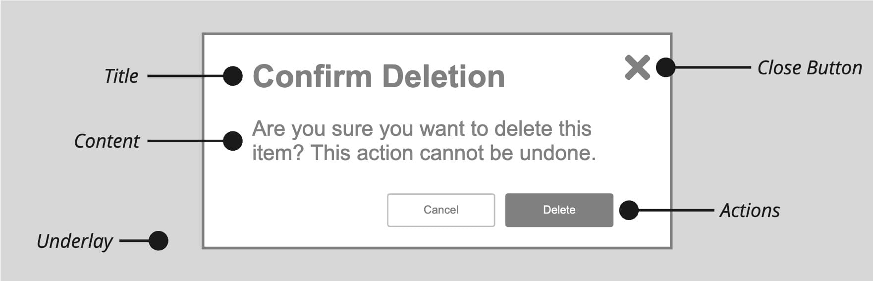
Appearance
The appearance of a component can be customized using the variant and size props. These props adjust the visual style and dimensions of the component, available values are based on the active theme.
| Property | Type | Description |
|---|---|---|
variant | - | The available variants of this component. |
size | xsmall | small | medium | large | fullscreen | The available sizes of this component. |
Usage
A dialog is used to capture the user's attention for tasks that require focus, such as confirming actions, filling out forms, or providing important information. Common use cases include confirmation prompts, data entry, and notifications.
When using a dialog, it's important to ensure it doesn't unnecessarily interrupt the user's workflow and that it provides a clear way to close or complete the interaction. Dialogs should be concise, focused on a single task and while they are highly versatile, dialogs aren't suitable for every situation. They can be intrusive and should be used sparingly.
Do
Use a dialog when
- an immediate response is needed to continue a user-initiated process,
- to notify the user of urgent information related to their task, or
- to confirm a user decision.
Labeling
To correctly label a dialog, always include a title (<Dialog.Title>) or an aria-label so users understand its purpose. The title should be concise and descriptive, using a verb-noun combination (e.g., "Edit Profile" or "Confirm Purchase"). If no visible title is used, ensure that the dialog is properly labeled with an aria-label for accessibility.
For short, straightforward messages, you can combine the title and the message to make things clearer and avoid repeating information in both the title and content. If you do this, there should be no additional text in the content of the dialog.
<Dialog aria-label="delete event">
  <Dialog.Title>Are you sure you want to delete this event?</Dialog.Title>
  <Dialog.Actions>
    <Button variant="secondary" slot="close">
      Cancel
    </Button>
    <Button variant="destructive">Delete</Button>
  </Dialog.Actions>
</Dialog>
Title and description
<Dialog.Title> and <Dialog.Description> are slot-aware: the heading level, id, and aria-labelledby wiring are handled for you. <Dialog.Header> is an optional layout wrapper that groups a title and description into one header zone — reach for it when you need both. For a title-only dialog you can drop the title straight into <Dialog> without a header.
import { Button, Dialog, Title } from '@marigold/components';export default () => ( <Dialog.Trigger> <Button variant="primary">Open</Button> <Dialog size="xsmall" closeButton> <Title>Session expiring</Title> <Dialog.Content> Your session will expire in 5 minutes. Save your work to avoid losing changes. </Dialog.Content> <Dialog.Actions> <Button slot="close">Dismiss</Button> <Button variant="primary" slot="close"> Stay signed in </Button> </Dialog.Actions> </Dialog> </Dialog.Trigger>);Content
Keep dialogs simple by limiting the number of interactions. Remove any content or elements that aren't essential to completing the task. For instance, if the dialog is for editing a user's profile information, only include the necessary fields like name and email, rather than unrelated options like notification settings.
import { Button, Dialog, Stack, Text, TextField } from '@marigold/components';import { User } from '@marigold/icons';export default () => ( <Dialog.Trigger> <Button variant="primary"> <User /> Edit </Button> <Dialog size="xsmall"> <Dialog.Title>Edit User</Dialog.Title> <Dialog.Content> <Stack space={3}> <Text>Update your account information.</Text> <TextField label="Name" autoFocus /> <TextField label="Email" type="email" /> </Stack> </Dialog.Content> <Dialog.Actions> <Button variant="secondary" slot="close"> Cancel </Button> <Button variant="primary">Update</Button> </Dialog.Actions> </Dialog> </Dialog.Trigger>);It's also best to avoid multi-step processes or requiring users to navigate within the dialog, as this can complicate the experience. If a task is too complex, consider using a dedicated page instead.
Lastly, avoid asking users to make decisions that require information not accessible in the dialog, such as needing to check a different page or document to proceed, since this can frustrate users and disrupt their workflow.
Sizes
The size prop controls how much space a dialog takes. Most dialogs use one of the default sizes (xsmall to large, defaulting to small), which cap the width and let the dialog hug its content.
Use fullscreen for content-heavy tasks, such as multi-column pickers or dense tables, where a boxed dialog would cramp the content. It fills the viewport minus a small margin at every breakpoint and keeps the title and actions pinned while only the content scrolls. Prefer a smaller size for focused, single-task dialogs like confirmations or short forms.
Dismissal
When a dialog is open, users cannot interact with the rest of the page until the dialog is closed. To accommodate both mouse and keyboard users, the <Dialog> provides multiple ways to close it:
- pressing the close button (
slot="close") inside<Dialog.Actions>, - using the close button (indicated by an "x"),
- pressing the "Esc" key, or
- clicking on the underlay (the dimmed background).
To prevent the dialog from closing when the underlay is (accidentally) clicked, you can set the dismissable prop on the <Dialog.Trigger> component to false. This disables closing the dialog by clicking on the background, ensuring that the dialog remains open until the user interacts with the provided buttons or other close mechanisms.
import { Button, Dialog } from '@marigold/components';export default () => ( <Dialog.Trigger dismissable> <Button variant="primary">Duplicate</Button> <Dialog closeButton size="small"> <Dialog.Title>Duplicate event</Dialog.Title> <Dialog.Content> Duplicating this event will create a new event with all the original details pre-filled, except for the date. </Dialog.Content> <Dialog.Actions> <Button variant="secondary" slot="close"> Cancel </Button> <Button variant="primary">Duplicate</Button> </Dialog.Actions> </Dialog> </Dialog.Trigger>);Dedicated close button
To conveniently create a close button for a dialog, set the slot prop to "close" on any <Button> within <Dialog.Actions> component. Pressing the button will then close the dialog.
Role
When a dialog requires the user's immediate attention, such as for an error or warning, set role="alertdialog". This role ensures that assistive technologies, like screen readers, treat the dialog as high-priority, immediately notifying users of its content.
It is essential for situations where the user must address an issue before continuing, such as critical system errors or warnings about destructive actions. Proper use of role="alertdialog" improves accessibility and ensures important messages are not missed.
Confirmation
A confirmation dialog asks a user to verify an action, preventing accidental and destructive outcomes. Use it for irreversible actions with significant consequences, such as permanently deleting a file or discarding unsaved changes.
For an effective dialog, be specific in your prompt. For example, ask "Permanently delete this account?" instead of a generic "Are you sure?". Action buttons should have clear, unambiguous labels like "Delete" and "Cancel". To avoid user fatigue, reserve confirmation dialogs only for actions that truly warrant a second thought, not for minor tasks.
Use the useConfirmation hook for this use case. This hook provides a simple API to trigger confirmation dialogs programmatically, making it easy to prompt users for confirmation before performing critical actions. It returns a function that opens the dialog and resolves with the user's response, allowing you to handle confirmation logic directly in your code.
import { Menu, useConfirmation } from '@marigold/components';export default () => { const confirm = useConfirmation(); const handleAction = async (action: 'save' | 'delete') => { switch (action) { case 'save': alert('saved!'); break; case 'delete': await confirm({ variant: 'destructive', title: 'Confirm delete', content: 'Are you sure you want to delete this event? This action cannot be undone.', confirmationLabel: 'Delete', }); break; default: throw new Error(`Unhandled action "${action}"!`); } }; return ( <Menu onAction={handleAction} label="Settings"> <Menu.Item id="save">Save</Menu.Item> <Menu.Item id="delete" variant="destructive"> Delete </Menu.Item> </Menu> );};Styling for Negative Consequences
For actions with potentially negative consequences, such as deleting an item, apply the "destructive" variant to the <ConfirmationDialog>. This will automatically style the dialog and its primary action button to visually communicate a serious or irreversible operation
Props
Dialog
Prop
Type
Accessibility props (5)
Prop
Type
DOM event handlers (64)
Prop
Type
Dialog.Trigger
Prop
Type
DOM event handlers (64)
Prop
Type
Dialog.Title
Prop
Type
Dialog.Content
Prop
Type
Dialog.Actions
Prop
Type
ConfirmationDialog
Prop
Type
ConfirmationDialog.Trigger
Prop
Type
DOM event handlers (64)
Prop
Type