TopNavigation
A component for building a persistent top navigation bar with flexible slot-based layout.
The <TopNavigation> is a component that provides a consistent, accessible navigation bar at the top of an application. It uses a three-slot layout with start, middle, and end sections, giving you full control over how navigation links, and user actions are arranged.
Anatomy
The <TopNavigation> component uses a compound component pattern with three slots arranged in a CSS grid layout.
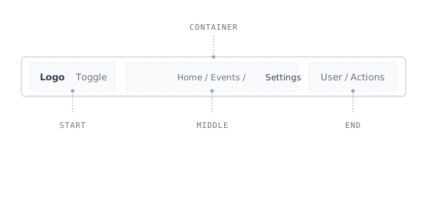
- Container: The outer
<header>element that holds the three-column grid layout. - Start: The left-aligned slot. It holds the sidebar toggle, and in the rail shell also the application logo and breadcrumbs.
- Middle: The flexible center slot, rendered as a
<nav>element. Commonly holds breadcrumbs, or a search field. - End: The right-aligned slot, also rendered as a
<nav>element. Typically contains utility actions such as user menus, notifications, or settings.
Appearance
The appearance of a component can be customized using the variant and size props. These props adjust the visual style and dimensions of the component, available values are based on the active theme.
| Property | Type | Description |
|---|---|---|
variant | - | The available variants of this component. |
size | - | The available sizes of this component. |
Usage
The <TopNavigation> component organizes the top-level navigation of an application into three distinct sections. Place the sidebar toggle in <TopNavigation.Start>, breadcrumbs in <TopNavigation.Middle>, and utility actions like user menus in <TopNavigation.End>. In the rail shell, where the bar spans the full viewport width, the logo and the breadcrumbs join the toggle in the start slot.
Centering content in the middle slot
Some layouts call for centered content in the navigation bar, such as a search field. Use the alignX prop on <TopNavigation.Middle> to horizontally center its content within the available space. Note that alignX only applies to the Middle slot. Start and End are always aligned to their respective edges.
import { Button, SearchField, Sidebar, TopNavigation,} from '@marigold/components';export default () => ( <Sidebar.Provider defaultOpen> <TopNavigation> <TopNavigation.Start> <Sidebar.Toggle /> </TopNavigation.Start> <TopNavigation.Middle aria-label="Search" alignX="center"> <SearchField placeholder="Search..." /> </TopNavigation.Middle> <TopNavigation.End> <Button variant="secondary" size="small"> Sign in </Button> </TopNavigation.End> </TopNavigation> </Sidebar.Provider>);Sticky navigation
By default, <TopNavigation> sticks to the top of the viewport when users scroll, ensuring persistent access to navigation. This is the most common behavior for application shells.
If the navigation bar is not needed while scrolling (e.g., on compact pages where content fits within the viewport), you can disable sticky behavior by setting sticky={false}.
import { Breadcrumbs, Button, Sidebar, Stack, Text, TopNavigation,} from '@marigold/components';export default () => ( <Sidebar.Provider defaultOpen> <div style={{ height: '300px', overflow: 'auto' }}> <TopNavigation> <TopNavigation.Start> <Sidebar.Toggle /> </TopNavigation.Start> <TopNavigation.Middle> <Breadcrumbs> <Breadcrumbs.Item href="#">Home</Breadcrumbs.Item> <Breadcrumbs.Item href="#">Events</Breadcrumbs.Item> <Breadcrumbs.Item href="#">Event Details</Breadcrumbs.Item> </Breadcrumbs> </TopNavigation.Middle> <TopNavigation.End> <Button variant="secondary" size="small"> Sign in </Button> </TopNavigation.End> </TopNavigation> <div style={{ padding: '2rem' }}> <Stack space={4}> <Text weight="bold" size="xl"> Summer Festival </Text> <Text> Scroll this container to see the navigation stick to the top. The sticky behavior ensures users always have access to navigation, even when browsing long pages of content. </Text> <Text> Lorem ipsum dolor sit amet, consectetur adipiscing elit. Sed do eiusmod tempor incididunt ut labore et dolore magna aliqua. Ut enim ad minim veniam, quis nostrud exercitation ullamco laboris nisi ut aliquip ex ea commodo consequat. Duis aute irure dolor in reprehenderit in voluptate velit esse cillum dolore eu fugiat nulla pariatur. </Text> <Text> Excepteur sint occaecat cupidatat non proident, sunt in culpa qui officia deserunt mollit anim id est laborum. Sed ut perspiciatis unde omnis iste natus error sit voluptatem accusantium doloremque laudantium, totam rem aperiam, eaque ipsa quae ab illo inventore veritatis et quasi architecto beatae vitae dicta sunt explicabo. </Text> </Stack> </div> </div> </Sidebar.Provider>);Combining with Sidebar
For applications with multiple levels of navigation, combine <TopNavigation> with the Sidebar component to follow the recommended L-Shape layout structure. The top bar handles opening the sidebar and hosting global utility actions, while the Sidebar provides contextual navigation within each section.
Logo placement
Where the application logo lives depends on the shell layout. With two-level
navigation
(Sidebar.Rail) the top bar spans the full viewport width, so the logo goes
into <TopNavigation.Start>, ahead of the <Sidebar.Toggle variant="rail" />,
where it holds the fixed top-left spot. Breadcrumbs follow the toggle in the
same slot, keeping the whole wayfinding cluster on the left edge. With a
single-column <Sidebar>, place the logo in the Sidebar's header instead. In
that layout the top bar starts beside the sidebar and stays focused on
navigation and utility actions.
The <TopNavigation.Middle> slot adapts to your application's navigation model. We recommend using it for Breadcrumbs to give users a clear trail back to parent sections, or for a search field to provide quick access to content across the application. This flexibility lets the <TopNavigation> and <Sidebar> work as complementary layers. The top bar orients users globally, while the Sidebar guides them locally within the current section.
Do
Use meaningful aria-label props when multiple <nav> landmarks exist on the page. Middle and End both render <nav>, so distinct labels help screen reader users differentiate them.
Don't
Don't place too many items in the navigation bar. Prioritize the most important actions and group secondary ones in menus.
Mobile Navigation
Mobile navigation should prioritize simplicity. Reduce the number of visible items and use progressive disclosure to keep the interface focused.
The <TopNavigation> itself does not handle responsive behavior. The components placed inside it are responsible for adapting to different screen sizes. On small screens:
- Collapse non-essential items: Hide labels and show icon-only actions. Use
useResponsiveValue()oruseSmallScreen()to control visibility at each breakpoint. - Breadcrumbs: Use fewer segments on small screens. The Breadcrumbs component supports collapsing via the
maxVisibleItemsprop.
Accessibility
The <TopNavigation> renders a semantic <header> element, while <TopNavigation.Middle> and <TopNavigation.End> each render a <nav> landmark. When both are present, screen readers detect multiple navigation landmarks, so provide distinct aria-label values to help users differentiate them (e.g., "Main navigation" vs "User actions").
Props
TopNavigation
TopNavigation.Start
TopNavigation.Middle
Accessibility props (1)
TopNavigation.End
Accessibility props (1)
Alternative components
Tabs: If you only need tab-based navigation without a full navigation bar layout, use Tabs directly.
Breadcrumbs: For displaying hierarchical navigation paths that can be placed inside or outside of a TopNavigation.