EmptyState
Inform users when there is no content to display.
The <EmptyState> component is used to communicate that a container, list, or page currently has no data to display. It provides visual confirmation that the lack of data is a valid system state, ensuring users do not mistake the empty space for a loading error or a bug.
It serves as a bridge between an empty screen and a populated one, offering context and guidance.
Anatomy
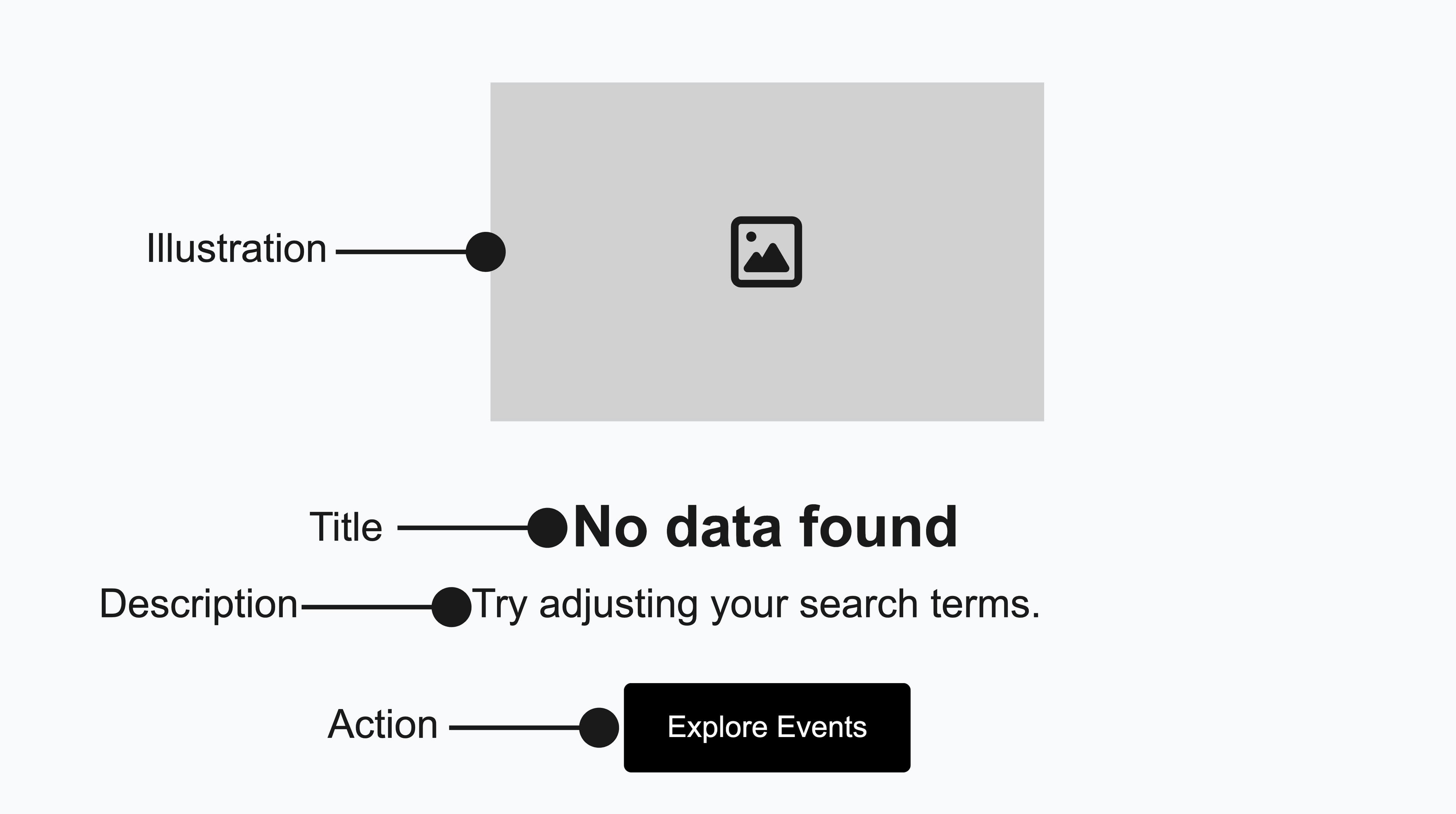
The EmptyState component typically consists of the following elements:
Appearance
The appearance of a component can be customized using the variant and size props. These props adjust the visual style and dimensions of the component, available values are based on the active theme.
No products in your cart
| Property | Type | Description |
|---|---|---|
variant | - | The available variants of this component. |
size | - | The available sizes of this component. |
Usage
The <EmptyState> component is ideal for scenarios where a user might expect to see content, but the data set is empty despite a successful page load.
Use this component to confirm that the lack of data is a valid state in the following situations:
- Initial States: When a user visits a feature or dashboard for the first time and has no data due to a lack of activity.
- User-Cleared States: When a user has successfully resolved, deleted, or triaged all items in a list.
- No Results (Search & Filter): When a list or table is empty because no items match the current search query or applied filters.
Do
Reserve empty states for the primary content area of a page or view.
Don't
Avoid displaying multiple illustrated empty states on the same screen.
Event Name | Date | Venue | Status |
|---|---|---|---|
No events foundThere are currently no events to display. Add new events to see them here. | |||
import { Button, EmptyState, Table } from '@marigold/components';export default () => ( <Table aria-label="Events Table"> <Table.Header> <Table.Column>Event Name</Table.Column> <Table.Column>Date</Table.Column> <Table.Column>Venue</Table.Column> <Table.Column>Status</Table.Column> </Table.Header> <Table.Body emptyState={() => ( <EmptyState title="No events found" description="There are currently no events to display. Add new events to see them here." action={ <Button size="small" variant="primary"> Add New Event </Button> } /> )} > {[]} </Table.Body> </Table>);Best Practices
Timing is critical when displaying empty states. Always show a loading indicator (Skeleton or Spinner) while data is being fetched, and only reveal the empty state after the request completes and confirms no results exist. This prevents the "Flash of Empty Content" - a jarring flicker that can confuse users and make the interface feel unstable.
It's equally important to distinguish between empty and error states. Use the <EmptyState> component exclusively for successful operations that return no data. For system failures, network errors, or other exceptions, use an ErrorState instead (see the error boundaries pattern). This clear separation helps users understand whether they need to take action or simply recognize that no content exists yet.
Content Strategy
Effective <EmptyState> content serves as a conversation with the user, bridging the gap between a blank screen and their first successful interaction. Since an empty screen can be mistaken for a system error, the messaging should immediately reassure users that everything is functioning as expected. The text must confirm that the application is working correctly and that the lack of data is a valid state.
Do
Use a clear title and description to explain the empty state and guide users on next steps.
Keep the tone concise, human, and friendly to reassure users the system is working correctly.
Don't
Avoid vague titles and lack of descriptions that leave users confused about the empty state.
Avoid robotic phrasing or technical jargon that might suggest the user made a mistake.
Accessibility
The <EmptyState> component is accessible by default through its required title, which renders as a semantic heading (<h3> by default) so screen reader users can navigate to it. Adjust the level with the headingLevel prop so it fits the surrounding document outline. The decorative illustration is marked with aria-hidden="true", ensuring assistive technologies correctly ignore it and focus on the meaningful text content.
Props
EmptyState
Prop
Type
Alternative components
Loader: Use for loading states before data is fetched. Unlike
EmptyState, loaders indicate that content is actively being retrieved and will appear shortly.ErrorState: Use for failures. When data retrieval or rendering breaks,
ErrorStatereplaces the content area and offers a way to recover. See the error boundaries pattern.