Pagination
Component that divides up large datasets into manageable chunks.
Pagination is used to divide and navigate large data sets, like a table or list of search results. It benefits users by reducing cognitive load as well as improving system performance.
Anatomy
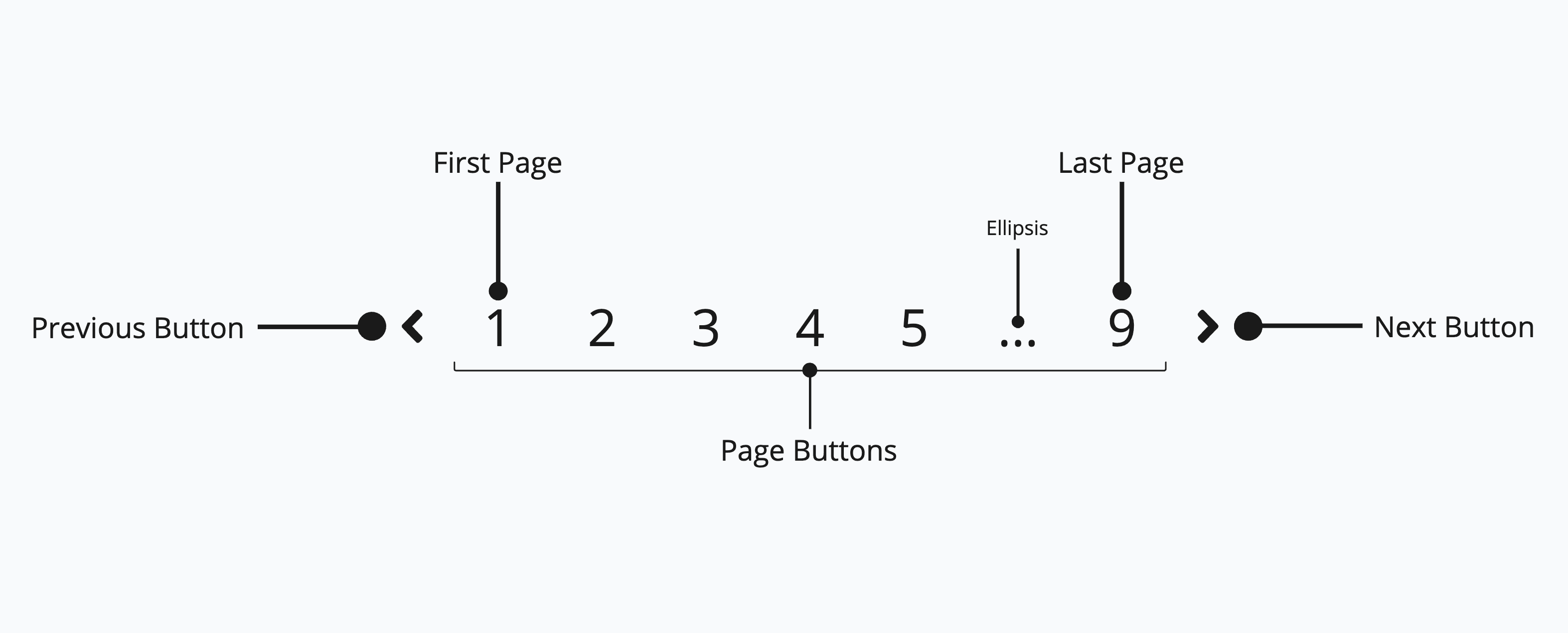
The <Pagination> component consists of:
- A "previous" button
- A max of seven page buttons
- A "next" button
Each page button is a text <Button> labelled with its respective page number. If the total number of pages exceeds seven, some pages will be hidden with an ellipsis ("…").
Appearance
The appearance of a component can be customized using the variant and size props. These props adjust the visual style and dimensions of the component, available values are based on the active theme.
| Property | Type | Description |
|---|---|---|
variant | - | The available variants of this component. |
size | - | The available sizes of this component. |
Usage
Pagination is used to divide large datasets into discrete pages, making them manageable and enhancing the user experience when browsing through search results or tables.
Use pagination when the amount of dataset results would be too overwhelming for one page, either for the user or the system performance.
Prefer pagination over infinite scrolling when users work on the data rather than browse it. A page is a stable, bounded view. Users can reason about "these rows", return to them, and select them for an action. Infinite scrolling suits passive browsing. For tables where users select rows and act on them it creates ambiguity, because "select all" could mean what is visible, what has loaded so far, or everything that matches the query. This is why task-oriented tables in Marigold paginate.
Pagination is not a replacement for search, filter or sort functionality, but rather a complementary feature.
ID | Name | Email | Role | Status |
|---|---|---|---|---|
1 | User 1 | user1@example.com | Admin | inactive |
2 | User 2 | user2@example.com | User | active |
3 | User 3 | user3@example.com | User | active |
4 | User 4 | user4@example.com | Admin | active |
5 | User 5 | user5@example.com | User | inactive |
6 | User 6 | user6@example.com | User | active |
7 | User 7 | user7@example.com | Admin | active |
8 | User 8 | user8@example.com | User | active |
9 | User 9 | user9@example.com | User | inactive |
10 | User 10 | user10@example.com | Admin | active |
import { useState } from 'react';import { Inline, Pagination, PaginationProps, Select, Split, Stack, Table, TableProps, Text,} from '@marigold/components';export default (paginationProps: PaginationProps, tableProps: TableProps) => { interface User { id: number; name: string; email: string; role: string; status: 'active' | 'inactive'; } const [currentPage, setCurrentPage] = useState(1); const [pageSize, setPageSize] = useState(10); const mockData: User[] = Array.from({ length: 35 }, (_, i) => ({ id: i + 1, name: `User ${i + 1}`, email: `user${i + 1}@example.com`, role: i % 3 === 0 ? 'Admin' : 'User', status: i % 4 === 0 ? 'inactive' : 'active', })); const startIndex = (currentPage - 1) * pageSize; const endIndex = Math.min(startIndex + pageSize, mockData.length); const currentData = mockData.slice(startIndex, endIndex); return ( <Stack alignX="left" space={2}> <Table aria-label="label" {...tableProps}> <Table.Header> <Table.Column rowHeader>ID</Table.Column> <Table.Column>Name</Table.Column> <Table.Column>Email</Table.Column> <Table.Column>Role</Table.Column> <Table.Column>Status</Table.Column> </Table.Header> <Table.Body items={currentData}> {item => ( <Table.Row key={item.id}> <Table.Cell>{item.id}</Table.Cell> <Table.Cell>{item.name}</Table.Cell> <Table.Cell>{item.email}</Table.Cell> <Table.Cell>{item.role}</Table.Cell> <Table.Cell>{item.status}</Table.Cell> </Table.Row> )} </Table.Body> </Table> <div className="w-full"> <Inline alignY="center"> <Text fontSize="sm"> Showing {startIndex + 1} - {endIndex} of {mockData.length} </Text> <Split /> <Pagination {...paginationProps} totalItems={mockData.length} pageSize={pageSize} page={currentPage} onChange={setCurrentPage} /> <Split /> <Inline alignY="center" space={4}> <Text fontSize="sm">Results per page</Text> <Select width={20} value={pageSize.toString()} onChange={val => setPageSize(parseInt(`${val}`))} > <Select.Option id="10">10</Select.Option> <Select.Option id="20">20</Select.Option> <Select.Option id="30">30</Select.Option> </Select> </Inline> </Inline> </div> </Stack> );};Do
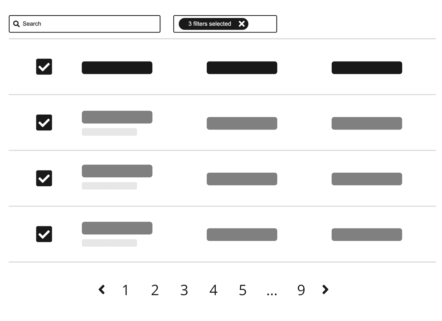
Pagination must always be used in conjunction with a dataset and search, filter or sort features.
Don't
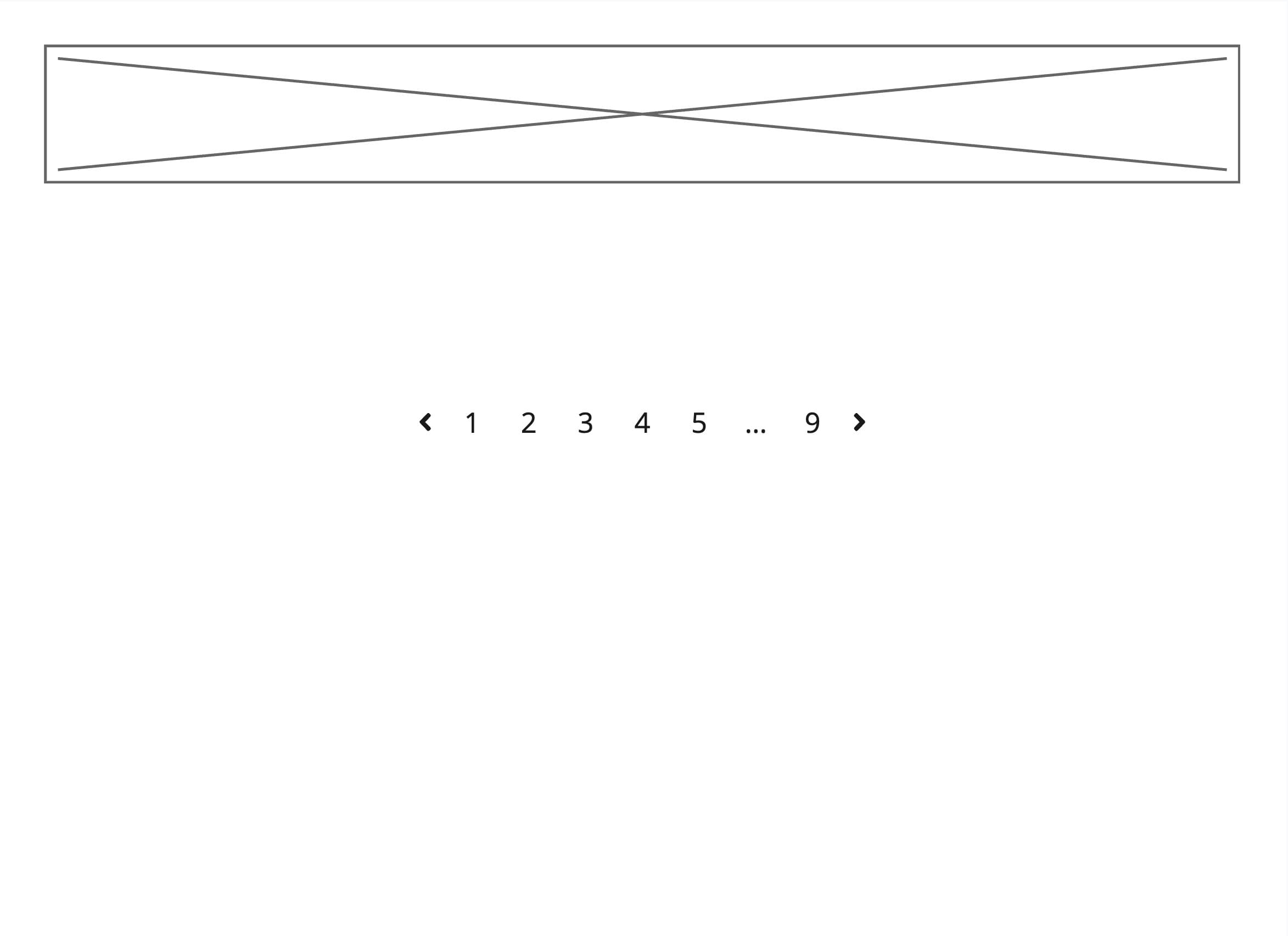
Don't use pagination on its own without a connected dataset and search, filter or sort features.
Managing results per page
Product teams must decide the default number of visible results per page when implementing the <Pagination> component.
Do
Set a sensible initial value for the number of visible results. This default value should protect the user as well as the system from being overloaded.
Results indicator
You can expand the <Pagination> component with a results indicator.

import { Inline, Pagination, PaginationProps, Select, Split, Text,} from '@marigold/components';export default (paginationProps: PaginationProps) => ( <div className="w-full"> <Inline alignY="center"> <Text>Showing 0 of 0</Text> <Split /> <Pagination {...paginationProps} totalItems={20} pageSize={5} /> <Split /> <Inline alignY="center" space={4}> <Text fontSize="sm">Results per page</Text> <Select width={20} aria-label="Page size" defaultValue="5"> <Select.Option id="5">5</Select.Option> <Select.Option id="10">10</Select.Option> </Select> </Inline> </Inline> </div>);An optional results indicator can be added to show:
- the range of visible results, and
- the amount of total results.
The indicator itself is not interactive.
The default text string is "Showing {range of visible results} of {total results}". Only change the default text if necessary for localization.
Don't
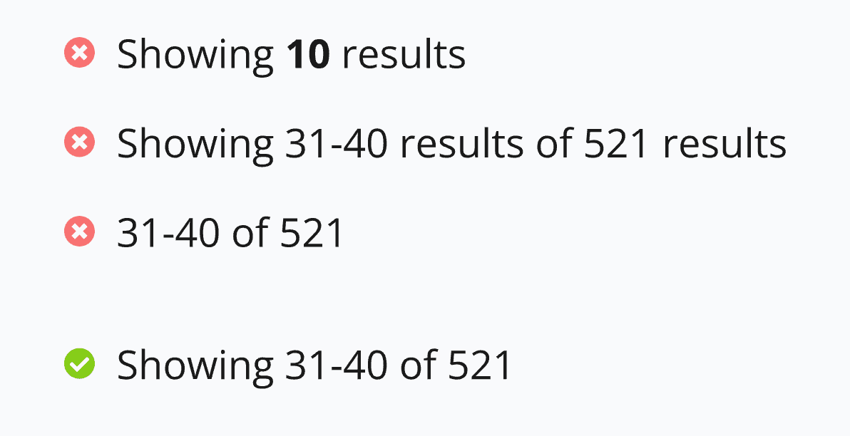
Don't change default text strings unless necessary for localization. The default text string is "Showing {range of visible results} of {total results}".
Quantity selector
You can expand the <Pagination> component with a quantity selector.

import { Inline, Pagination, PaginationProps, Select, Split, Text,} from '@marigold/components';export default (paginationProps: PaginationProps) => ( <div className="w-full"> <Inline alignY="center"> <Text>Showing 0 of 0</Text> <Split /> <Pagination {...paginationProps} totalItems={20} pageSize={5} /> <Split /> <Inline alignY="center" space={4}> <Text fontSize="sm">Results per page</Text> <Select width={20} aria-label="Page size" defaultValue="5"> <Select.Option id="5">5</Select.Option> <Select.Option id="10">10</Select.Option> </Select> </Inline> </Inline> </div>);An optional quantity selector can be added to allow the user to control the amount of visible results per page. Product teams can decide the options available in the <Select> dropdown.
The default text string for the label is "Results per page". Only change the default text if necessary for localization.
Don't
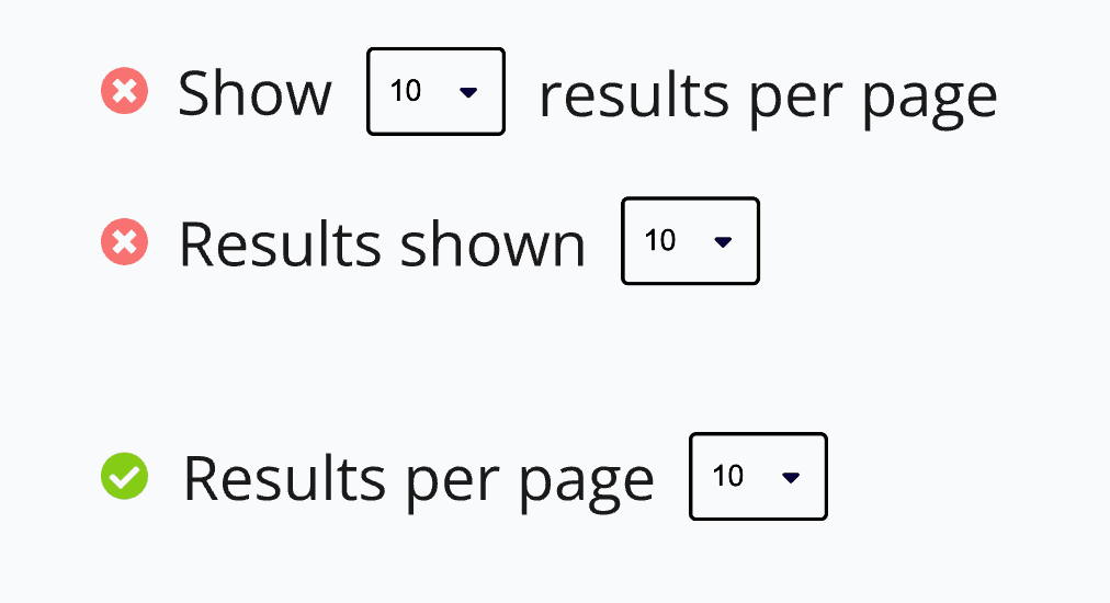
Don't change default text strings unless necessary for localization. The default text string is "Results per page".
Changing the page
A page change replaces the visible rows, and everything on the screen that was derived from those rows must be re-derived or visibly reset. Row selection is the most common case: a selection made on one page must not silently survive onto another, where the checked rows are no longer visible. The Bulk Actions pattern covers how selection and pagination interact in detail.
The dataset can also change underneath the current page. When records are deleted, the current page can end up past the last page, stranding the user on an empty view. Clamp the page index after the data changes, so the user lands on the new last page instead:
const lastPage = Math.max(1, Math.ceil(totalItems / pageSize));
if (page > lastPage) {
  setPage(lastPage);
}
Do
Reset or re-derive any state that was based on the visible rows when the page changes, and step back to the last page when the current page empties.
Don't
Don't leave the user on a page that no longer exists or carry hidden row-based state across a page change.
Summary: What decisions can product teams make?
- The default amount of visible results per page
- Whether to include the optional results indicator
- The results indicator text string (only change for localization)
- Whether to include the optional quantity selector
- The quantity selector label text string (only change for localization)
- The selectable values in the quantity selector dropdown
- Whether to use labels on the "Previous" and "Next" buttons
- The label text of the "Previous" and "Next" buttons (only change for localization)
Props
Pagination
Prop
Type
Accessibility
The <Pagination> component already meets all known relevant WCAG 2.2 AA standards. Product teams are responsible for changing aria-labels if they modify the connected text strings for localization.
Do
Make sure to adjust any aria-labels if localizing the visible labels of the previous and next buttons, the text of the results indicator, or the label of the quantity selector.