Text
Component for displaying text paragraphs
The <Text> component is a fundamental part of Marigold's content components. It is designed to display text in a structured and visually appealing way, making it easy to read and understand.
Anatomy
The <Text> consists of a single element that can be rendered as a <div>, <p>, or <span>. It supports various text properties such as alignment, size, weight, and color.
Appearance
The appearance of a component can be customized using the variant and size props. These props adjust the visual style and dimensions of the component, available values are based on the active theme.
| Property | Type | Description |
|---|---|---|
variant | default | muted | The available variants of this component. |
size | default | xs | sm | base | lg | xl | 2xl | 3xl | 4xl | 5xl | 6xl | 7xl | 8xl | 9xl | The available sizes of this component. |
The Text component supports variants to control visual emphasis.
| Variant | Description | When to use |
|---|---|---|
default | Standard text inheriting the current color. This is the default variant. | Body text, descriptions, and general content. |
muted | Dimmed text with reduced visual emphasis. | Secondary information, captions, or supporting details that shouldn't compete with primary content. |
Usage
The <Text> component is intended for all non-heading text, such as main content, detailed descriptions, and text within other components. Use it whenever you need to display standard paragraph text.
Do
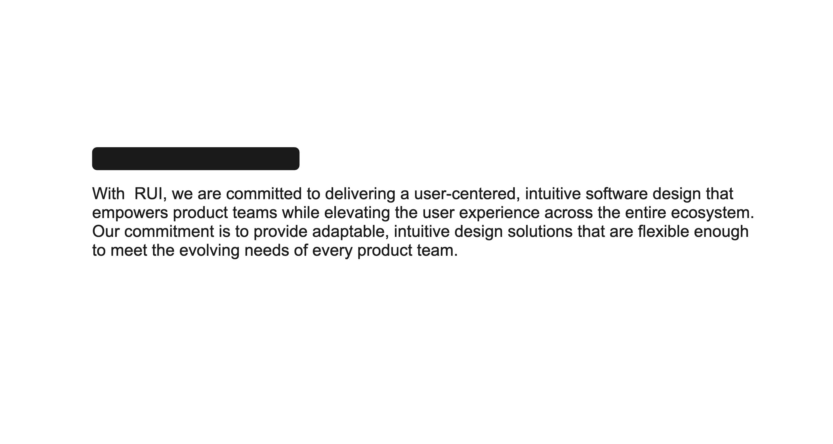
Use <Text> component for paragraphs or other body text.
Don't

Don't use the <Text> component for headings or titles. Use the <Heading> component instead.
Rendering as other HTML elements
The <Text> component can be rendered as different HTML elements by using the as prop. This allows you to change the underlying element without losing the styling and behavior of the <Text> component.
- Use a
<p>tag for paragraphs of text. - Use a
<span>for inline text inside a sentence or heading. - Use a
<div>for block-level layout elements without paragraph semantics.
Customizing text
Sometimes you want to highlight text or make it stand out from the rest of the content. The <Text> component supports a color prop that allows you to change the text color. Also you can set the weight and size of the text to make it more prominent.
import { Text } from '@marigold/components';export default () => ( <> <Text weight="bold">Ticket #47213 —</Text> <Text color="destructive"> Payment not processed</Text> </>);Props
Text
Prop
Type
Accessibility props (4)
Prop
Type
Alternative Component
- Headline: Use the
<Headline>component for titles and headings. It provides a more semantic structure for text that serves as a title or heading, ensuring better accessibility and SEO.